
Rope Up
Developer collaboration, interaction design, branding and visual design
RopeUp matches gym climbers in their area with partners who are available during the same times.
RopeUp helps to build community and fitness.
My Role
UX Designer- From ideation to creation I was involved every step of the way. The lead developer and I worked closely through the duration of the sprint. I created wireframes to guide the design, the visual design, and branding. Then using the Bulma CSS framework the final visual design.
Process
IDEO's Human Centered Design Process


User Research
Jordan and I are both connected with the Seattle climbing community. I reached out to climbers in the area to get their input on what was important to know about climbing partners prior to meeting up. Climbing is inherently risky so there are things about the person that users must know.
Users needed to know:
1. What discipline the climber is comfortable or interested in.
2. When they are available to climb at the gym.
3. What gym they climb at.
4. What "grades" or level they climb at.
What if it was as easy to find a climbing partner, as it is to rent a bike or go on a date?
RopeUp makes that dream a reality.
First Round of Prototypes
Working with the lead developer for the project, I started sketching, and created the first iteration of wireframes. Worked with the developer to understand his framework constraints, developed the next iteration. Lastly, we tested the prototype with local climbers.
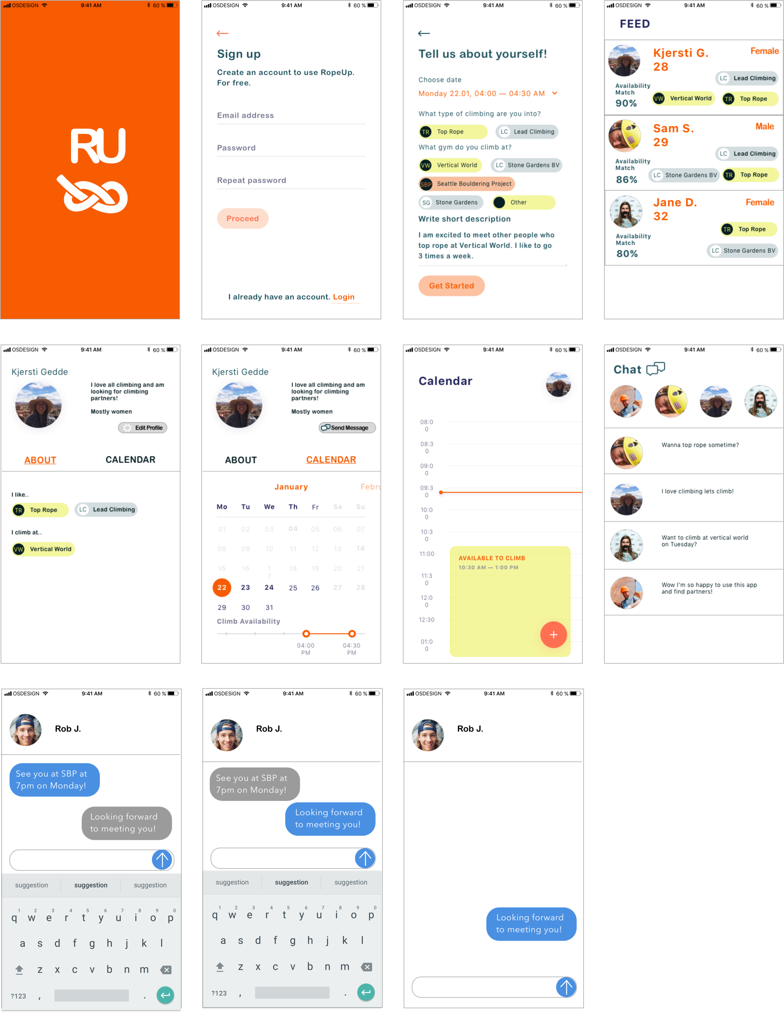
After sending this prototype over, it was clear that there were some design complications with the development framework we were using. After understanding the guidelines and constraints, I created another round of wireframes, as well as, redoing the color pallete.
After Development Framework Changes
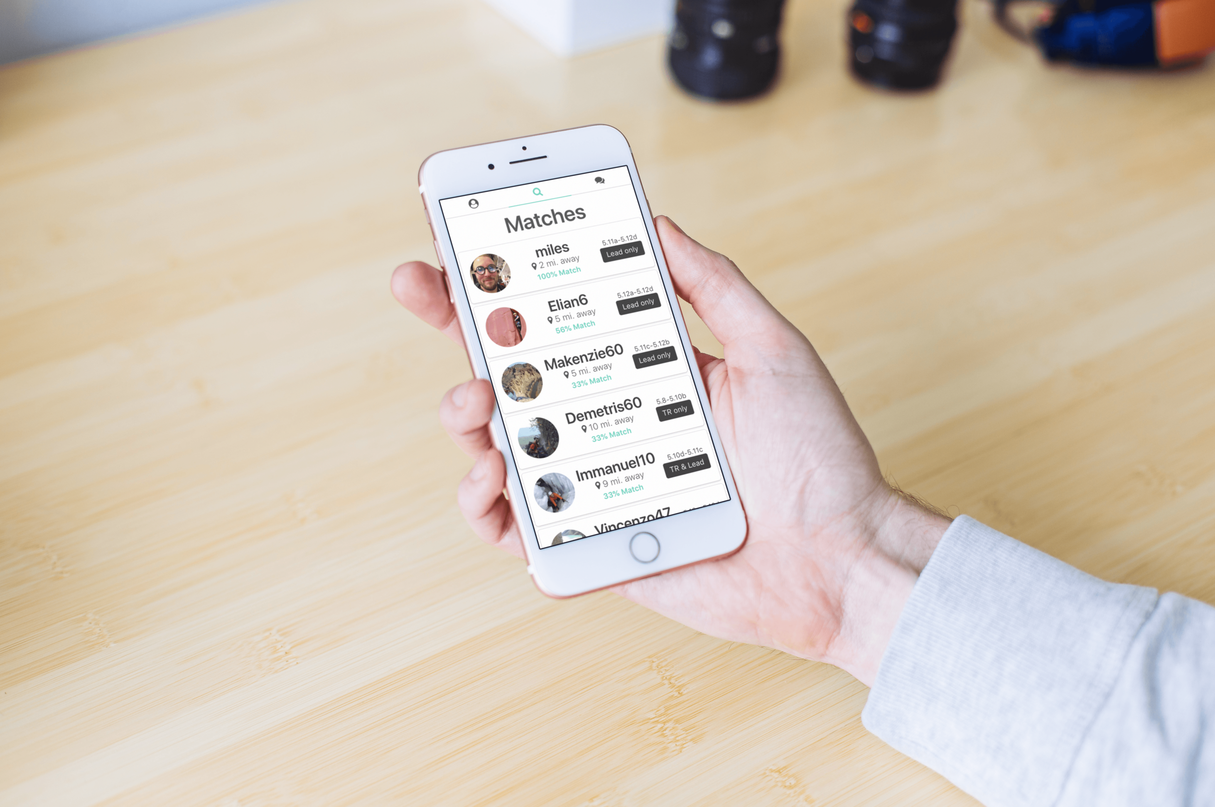
User Flow: jbdeam views personal info and his availability. He is able to edit the info on both tabs if he needs.

Next he views his matches, the percentage is the percent in which the two users' schedules align. It is important to climbers to know what discipline each partner is comfortable with or interested in. Also, the "grade" that one climbs can be an important factor in finding the right partner.
When jbdeam finds a match that looks appealing to him he selects that profile, in this case Elian6. From there he can see more information about that person and choose to message him directly to schedule a time to climb.
Users are notified with the red popup notification above the chat symbol when they have a new message.
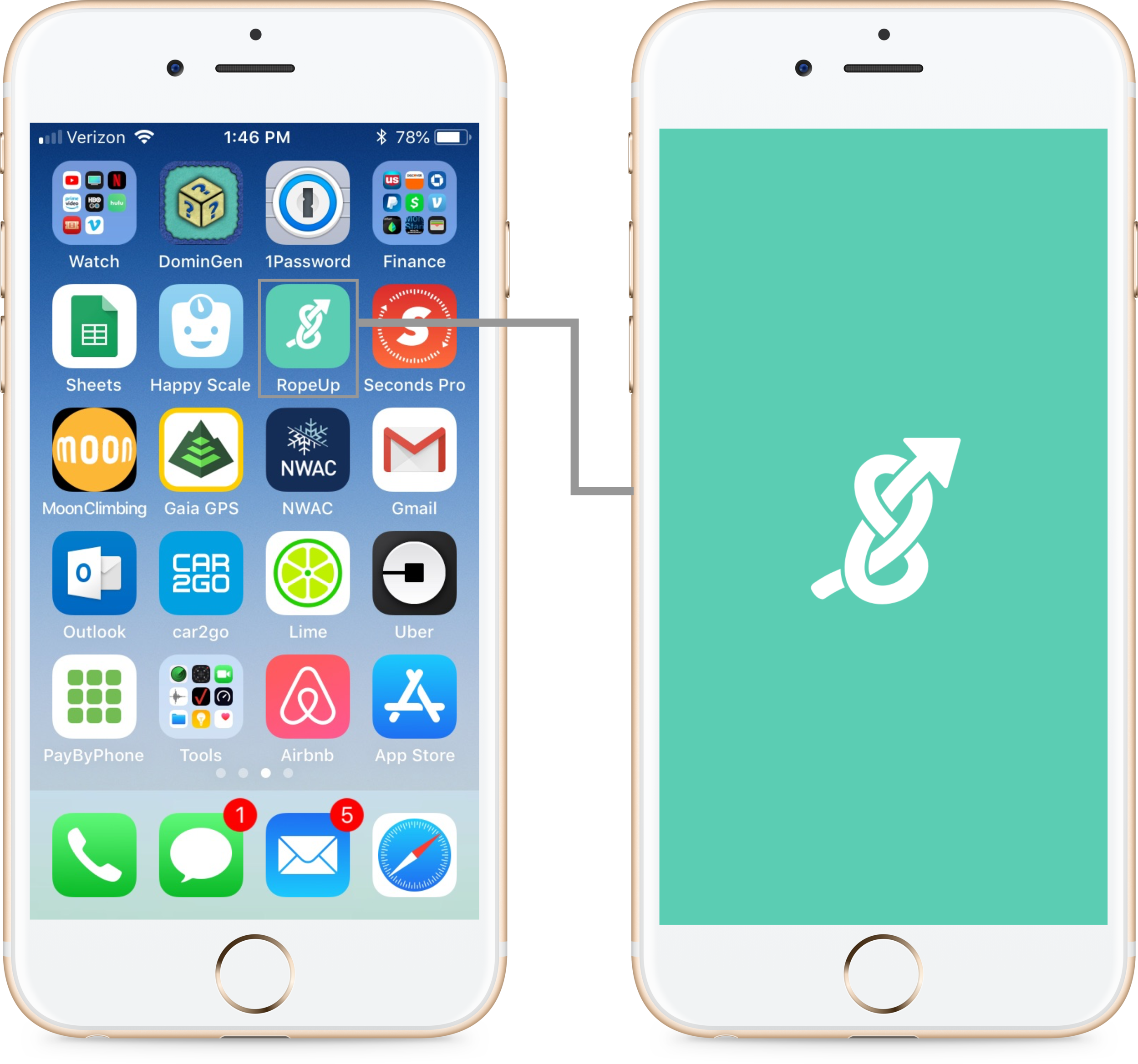
Logo Design:
Inspiration comes from the figure eight knot, which is the knot climbers use to tie into the rope. The arrow pointing up not only plays on the name but is a symbol of connection and improvement in the climbing community and users' climbing goals.
Branding:
Jordan and I created the brand. We brainstormed on what we wanted users to feel when opening up RopeUp. It was important that they viewed the app as trustworthy as a climbing partnership has inherent risk. But also, that it had a "fun" feel as bottom line it is an app to establish recreation partnerships. I then chatted with climbers in the Seattle area to get feedback on our branding.

What I learned:
- Understand the developer framework before creating the first prototype.
- Successful collaboration with lead developer.