CORAL
Product design from inception to MVP, interaction design, strategic client interviews, feature prioritization, usability testing
Women want ways to connect with other women, build community, and their career.
Coral, a Seattle startup, bridges this gap.
My Role
Interaction Design - Storyboard, wireframes, task flows, and prototypes.
Product Design - This is a new product so we built it from ideation to MVP.
Prototypes - Inspired and influenced by usability testing, comparative analysis, user research, and market research.
Client Interviews - Managed the conversation bridging the gap between client vision and user needs.
Through user research and usability testing we learned that our persona valued having an app specific to women to find career development resources. It was important to them to be able to search by multiple factors depending on what constraints they are operating under, such as time, location, or category.
User flow
Event search by time:
Showing the "about" in each event gives women more insight into what is going on at each event. This was a mandatory addition in design as users are looking for ways to make real connections. Knowing if there are small group breakout sessions was a must to many of our interviewees.
Process
IDEO's Human Centered Design Process
TIMELINE - 3 weeks
RESEARCH
I worked closely with our researcher to understand the data in information that she was gathering from future users. A survey with 52 respondents from diverse backgrounds and14 user interviews helped us to understand how users were finding career development tools now and where the gap in the market was. After gathering this information I created designs based on user's needs.
We found that women were looking for:
1. Networking events that have potential to make meaningful relationships. Specifically, events that include small group break outs.
2. Mentorship opportunities- the ability to find a mentor and maintain that connection.
3. Grow their current skills, and learn new professional skills.
My app design must include those 3 user needs.
This storyboard of Holly helps to illustrate the issue she is facing and how Coral helps her to find the resources she is seeking.
STORYBOARD
I use storyboards to help illustrate the problem the user is facing and how that problem will be solved by the design.
Comparative Analysis & Contextual Inquiry
Coral is a women's specific platform to connect users with classes, events, mentorship groups, and a forum. I studied Meetup, Eventbrite, Reddit, and Present apps, these companies fill sections of the market that the Coral app will bridge. Hexagon's website allowed me to understand what women-specific mentor groups are offering.
I gathered an understanding of how each company lays out their services. Through speaking to users I learned what worked well, what did not, and how they used each app.
Using the information gathered I used pieces of each app in the Coral app and avoided red flags users mentioned- like the cluttered interface of Present.
Paper Prototyping
Drawing inspiration from experts in each category, and user research I started paper prototyping followed by usability testing.
Usability Testing
I worked closely with our researcher to create task scenarios to test the app. We conducted 14 usability tests on 4 iterations of the coral wireframes. Fidelity varied from first, paper prototypes, to the fidelity shown above.
TASK SCENARIOS
- Find and like an event
- Find the “Saved” event
- Search for an event by time with the calendar option
- Check and explore calendar
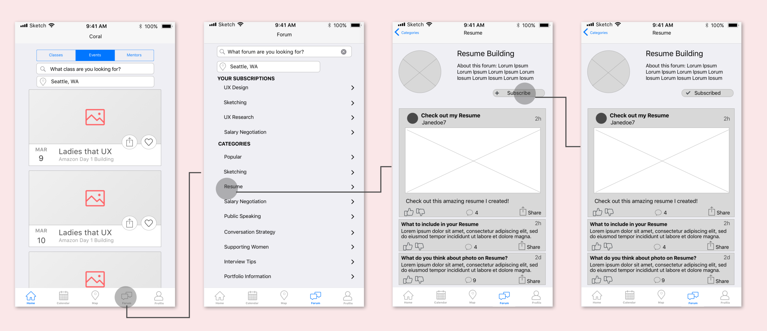
- Subscribe to the “Resume” forum channel
User Flows
Users wanted an app to help them establish real connections, rather than simply a new connection on LinkedIn.
The form feature allows users to post and interact with each other, give and receive feedback, and build their professional community.
Form visit and Subscription:
Find a ticket the user purchased: due to time constraints I used inspiration from market experts. For instance, the greying out of passed events was inpired by Eventbrite and a great way to save screen real estate.
Search by Location: We found through research, users, especially those without cars, want to find events and classes based on location.
Annotations
All designs and interactions below were developed through multiple iterations, user research, usability testing, comparative analysis, and contextual inquiry. Details about process to follow.
Next Steps
- Another round of usability testing.
- Iterations after usability test feedback.
- Work with developers to understand the scope of the project from their point of view.


