
Listen Boldly
Visual design, project management, and information architecture

An app for Benaroya Hall and Seattle Symphony to book tickets. The app's cluttered interface and confusing navigation was in need of a remodel.
My Role
Project Manager- Kept the team on track and ensured the project was moving along in a timely matter.
Visual Designer- Collaborated with the interaction designer to create HI-FI mock ups
Information Architect- Created wireflows to show the structure of the app.
PROCESS
IDEO's Human Centered Design Process

TIMELINE

2 weeks
SKILLS
Visual Design
Project Manager
Information Architecture
TOOLS
Sketch
Omnigraffle
Asana
Illustrator
Problem
Users need a way to quickly purchase and access tickets, and have more control over their seat selection through he Listen Boldly app. Currently it is a lengthy and complicated process which causes users to turn to alternative methods of purchasing tickets.
Solution
By simplifying the navigation, removing some features, and revamping the seat selection process users will be able to quickly purchase and access tickets. We will know this to be true when more users are purchasing tickets through the listen boldly app and report a positive experience.

VISUAL DESIGN GOALS
- Simplicity
- Maintain "bold" branding, we are not redoing the website so want to keep it consistent.
- Consistency
- Intuitive Design
- Analogous Color Scheme, the pink and purple were so loud keeping colors similar or neutral was decided as the best approach.
- All following Human Interaction Guidelines
The Old Interface

Problems
- Cluttered
- Overwhelming Hamburger Menu
- Unclear call to action buttons on landing screen
- Double calendars with repeated dates on each
- Seat Selector 9-11 clicks
Old Logo
Users found the double S, and instrumental metaphor hard to see and the logo overwhelming on the eyes.

New Logo
15 A/B tests with new logo ideas
Key Highlights:
- Easier to see the SS (Seattle Symphony)
- Piano Metaphor
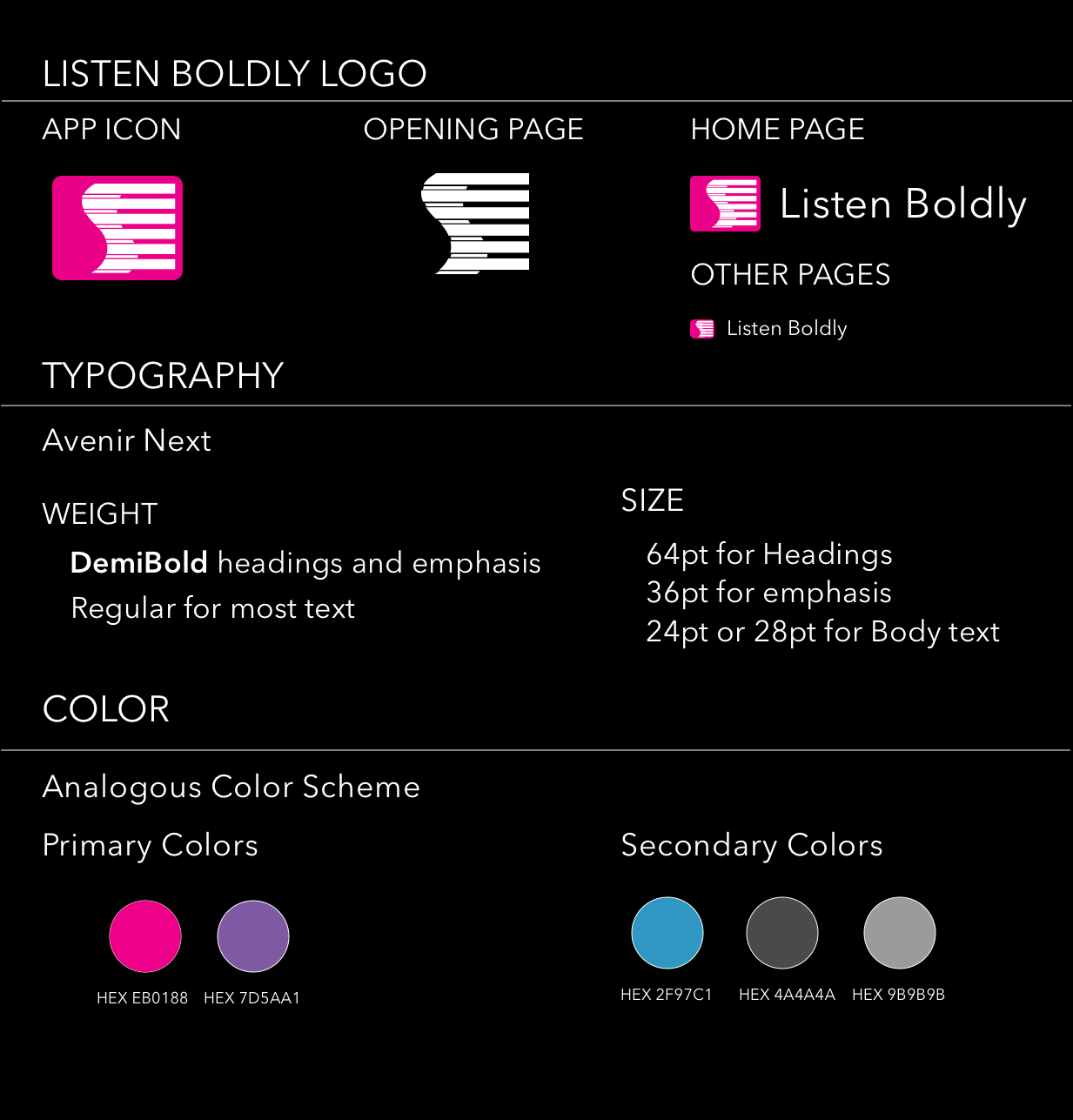
STYLE GUIDE
I created a style guide to base the apps visual design off of. We were redoing the app only, not the website so wanted to keep the branding consistent. Due to the bold nature of the Seattle Symphony/ Benaroya Hall's brand I kept the color scheme analogous.
Visual Mock-Up
- Ticketmaster inspired search on home screen.
- 4 Navigation elements in bottom nav bar.
- Visual weight to convey importance.
-Call to action color.
Seat Selector
Users wanted airline style seat selection.
Due to the small amount of real estate on the mobile device, my team and I created this 3-5 step process for seat selection.
Users reacted positively to this change.
Previously this was a 9-11 step process.

Wireflow
I created this to show the future of navigation and information architecture for the Listen Boldly app.
What we changed:
1. No more hamburger menu, replaced by bottom navigation bar.
2. Two calendars became one. Previously Benaroya hall and Seattle Symphony had their own calendars. However, Seattle Symphony events were also on Benaroya hall calendar.
3. No more videos in the app. Users would go to Youtube rather than watching in the app anyway.

Design Studio
KEY TAKEAWAYS
- Works wonders
- Helped us to narrow down seat selection process from 9-11 taps to 3-5.

Information Archetecture
Alex, one of four, card sort participants who helped me to figure out the direction of the new and improved information architecture for the new Listen Boldly App.

Interaction Design- Final Digital
By: Owen Camber